BGG and Greasemonkey
I spent the night learning a little about Javascript, a Firefox extension called Greasemonkey, and the Document Object Model (DOM). Javascript is a language that can be embedded in web pages, for one thing, to tweak content on the fly. Greasemonkey allows you to manage these scripts, edit them, assign which web sites/pages they work on, etc. The DOM is an internal representation of everything on a web page, even the stuff you can't see. Using Javascript, you can "walk" around in the DOM of a loaded page and modify things.
For a long time, the crazy colors and layout of BGG have really bugged me. There are too many shades of blue, and the modules appear to have randomized margins and padding. I spent some time poking around the DOM of BGG. It's really a huge mess in there! This is not meant to be a criticism. I understand how BGG has slowly evolved--tweak after tweak. It's really hard to grow something and keep it live and organized at the same time.
I was hoping everything was done with styles. For example, if you have a style that describes the background colors for the main menu, the recently viewed, and the modules, then you can modify that color in one place and it will affect everything. Unfortunately, that single darker blue color is defined all over the place, sometimes in styles, sometimes embedded in the HTML itself. This mean the script has to find all these places and modify them all. Also, since some of the places that needed to be tweaked can only be found by location (few objects in the HTML have id's or class names), any future changes to the layout of the DOM of BGG (eg different table layout, etc) would break the script. I managed to tweak everything I wanted, but I am not fluent enough in Javascript to claim that I did it in any reasonable way.
These are the things I tweaked in this first round:
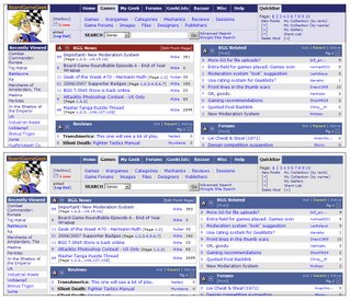
Too many shades of blue. I made the main menu and the recently viewed header the same blue as the normal modules. I also made the lower portion of the main menu light gray. Now there are only 3 background colors on the page with the exception of the BGG logo.Here's a before and after image of the changes:
Every "box" on the front page now has an 8-pixel margin on all sides, even the edges of the browser window.
I removed the footer, since I never use it.
 Here's the script I used to do this. You need Firefox and Greasemonkey to use it.


3 Comments:
I can't really get much more complicated than this unless Aldie puts in proper object id's or uses classes properly.
JavaScript is the language future. The new JavaScript Version (Ecmascript 6) has been relaeased.
JavaScript Online Training
Javascript Online Training
Wow. This really made my day. Thanks a lot!
Javascript Online Training Angularjs Training in CHennai
Post a Comment
<< Home